

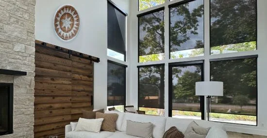
Begin with what you want to see.
Some homeowners want to preserve a view while softening light. Others place greater importance on screening the window. Describe the scene and the time of day that matter: a garden view, a street-facing window or a workstation beside bright afternoon light.
Those priorities help guide the sample conversation. A number on a specification sheet is easier to interpret when it is connected to an actual goal.
Do not let one number make the whole decision.
Solar-screen fabrics differ in more than openness. Color, weave and the complete product specification also matter. Avoid assuming that two fabrics with one shared characteristic will perform or appear identically.
Ask to review the particular fabrics under consideration, including the manufacturer’s current information. A website thumbnail is useful for orientation but does not replace a sample or project-specific review.
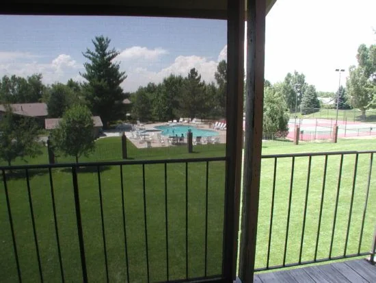
Keep nighttime privacy on a separate line.
A daytime view through screen fabric is not a nighttime privacy guarantee. When the room is illuminated after dark, the visual conditions change. If privacy matters, say so explicitly before the fabric direction is chosen.
You may want to discuss a privacy or blackout layer in addition to a solar screen. The appropriate arrangement depends on the opening, the room and the selected system.
Think about glare at the working position.
A shade is experienced from where you sit, stand or work, not only from directly in front of the window. Note the position of screens, seating and reflective surfaces. Take photos during the period when glare is most noticeable.
Explain whether the problem is direct light on a task, a bright view in the field of vision or another condition. That distinction makes the consultation more useful than choosing a fabric solely by how it looks against a window.
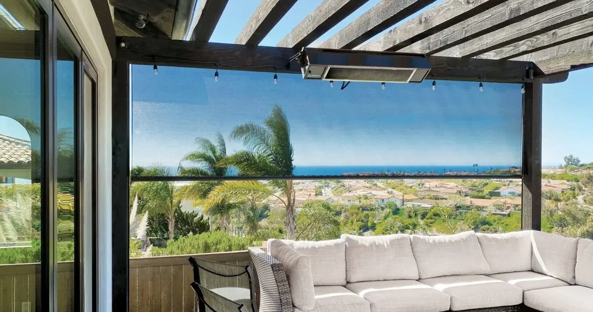
Confirm the final fabric in context.
Keep the fabric name and relevant specification attached to your shortlist. Review the selected direction with the intended mounting and operation, and ask what limitations remain.
The goal is an informed balance among view, light and privacy. No single fabric characteristic should be asked to stand in for all three decisions.
What does a percentage such as 1% or 10% mean?
Openness describes the relative area of openings in the fabric weave. Insolroll identifies lower-openness fabrics, such as 1% or 3%, as offering less direct view-through than a more open 10% fabric. It is a description of the screen, not a complete rating of the room’s comfort.
Do not read 5% openness as a promise that exactly 5% of all light, heat or ultraviolet radiation reaches your room. Those are different performance measures. Compare the manufacturer’s data for the exact fabric and color, along with a sample in the intended setting.
For example, someone preserving a garden view may accept a different balance from someone working beside harsh afternoon glare. Neither should choose on percentage alone. Nighttime privacy remains a separate requirement.
Compare the Choices
| Choice or situation | What to consider | What to check |
|---|---|---|
| Lower openness | Less open area and typically less direct view-through. | Compare the exact fabric and color. |
| Higher openness | A more open view through the screen. | Check whether glare control meets the room’s needs. |
| Same openness, different fabrics | The shared number does not make them equivalent. | Review color, weave and published performance data. |
Put This into Practice
- Ask what the openness percentage describes.
- Compare samples from the actual shortlisted fabrics.
- Keep nighttime privacy separate from the openness choice.
Product References
Consult the manufacturer’s information and confirm the exact specification for your project.